

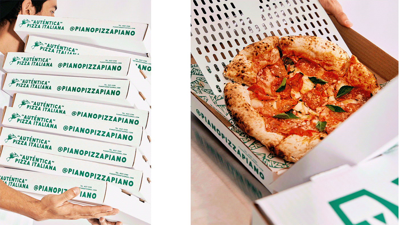

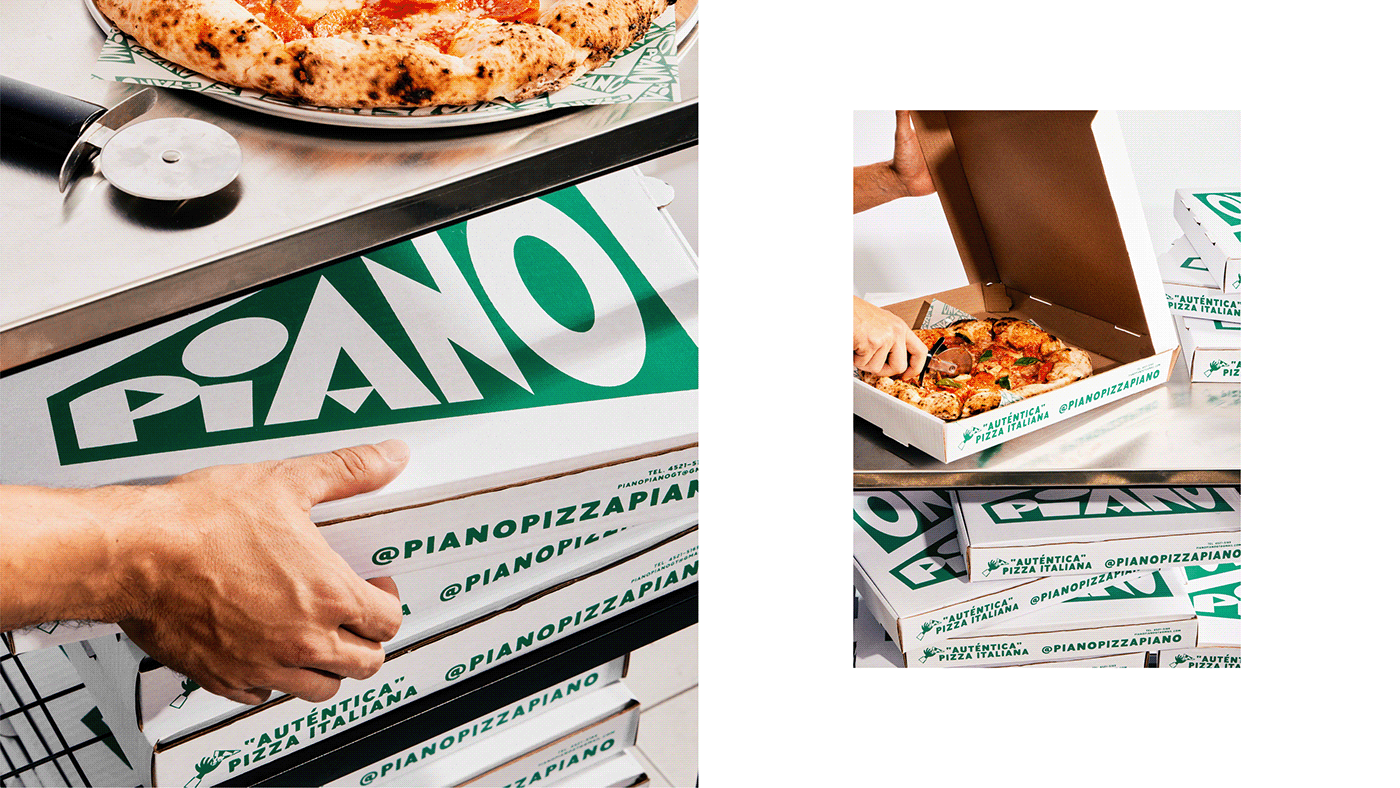


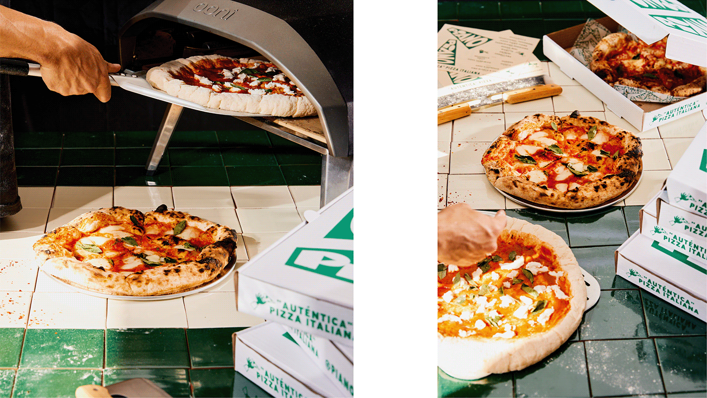
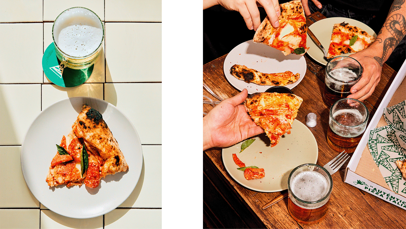

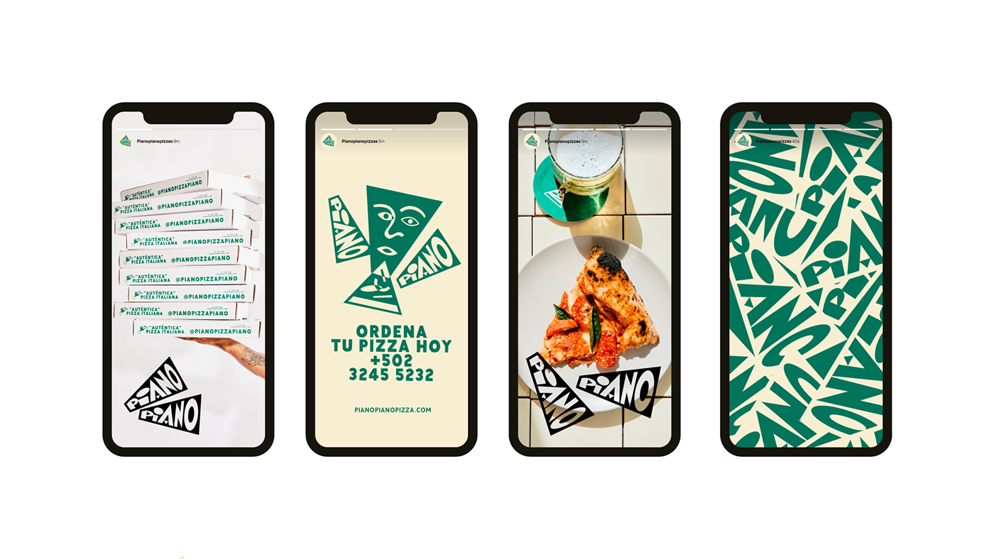


Branding for Piano Piano Pizza
Art Direction, branding, and packaging
Location: Guatemala City
Line of Business: Restaurant
Location: Guatemala City
Line of Business: Restaurant
The story behind Piano Piano begins with a family deeply rooted in Italian cuisine, a passion for good food, and a love for experimenting in the kitchen from a very young age. This culinary journey eventually turned their hobby into a profession. Piano Piano was born out of the scarcity of high-quality gastronomic experiences in the country. It aims to provide fresh and top-quality products, striving for the highest international standards, not limited to just the local level. The brand embraces its Italian heritage in a unique way. Taking inspiration from the Italian Futurist Reconstructivist art movement that emerged in Milan, Italy, Piano Piano seeks to break away from tradition, the past, and the conventional symbols that art history considered as its main elements—poetry, valor, audacity, and revolution. With these foundations, the branding adopts an explosive, eye-catching, and modern aesthetic for PIANO PIANO, challenging the conventions within the pizza industry in Guatemala.
The logo is constructed using the foundation of Italian typographic styles from the era of Reconstructivism. This typographic style advocated for geometric and grotesque typefaces, as they were used for posters, advertising, campaigns, protests, and more. Consequently, these typefaces needed to have elements that made them easy to read and recognize. The PIANO PIANO logo is a reinterpretation of these revolutionary styles, infused with a modern and friendly touch for the brand, creating a logo that is both recognizable and memorable.
The typography is presented in two triangular forms with rectangular endings, abstractly resembling a slice of pizza. This helps tie together the entire concept and narrative, adding dynamism to the brand.
More projects: www.andreshigueros.com
Photography: JPARK STUDIO


